

2016. Divi’s long-awaited Visual Builder has just made its debut, and since good news never comes alone, a small revolution seems to be simultaneously shaking up the plugin market, before coming to the fore later that year.
Code name of this plugin? Divi Booster. Its mission, should it decide to accept it? To revolutionize the way Divi users design their site. In short, quite a program!


In this article, I present WPMarmite’s opinion on the plugin, and some clever alternatives (even necessary, you’ll see!).
You’re not familiar with the Divi page builder, and want to learn more about it? Check out Nicolas’ test on WPMarmite before reading this post!
Overview
This article contains affiliate links. This means that WPMarmite will earn a commission if you decide to buy some of the solutions presented. This will not cost you any more and is a reward for the research and writing work of the blog authors.


Divi Booster, what is it?
Let’s put things in context.
Divi fans are discovering the power of its Visual Builder, and in the meantime, the most discerning among them are already starting to fiddle with the features of a nice UFO, which has come to make their lives as developers easier.
In fact, Divi Booster now offers everything that many web designers have always dreamed of: a list of options that complement Divi’s native features, which can be activated with a single click instead of using the CSS box. A dream come true!
And if some of them seem to be more of a decorative hobby, others have the virtue of compensating for some of Divi’s intrinsic shortcomings.
Even better: they even allow you to structure your site in an organized way, so that you can start from a clean and coherent base.

You will have understood it, Divi Booster cultivates, when it comes out, the noble vocation to reassure the obsessional of organization and good practices, before and/or during the creation of a website on Divi.
Some examples to see more clearly
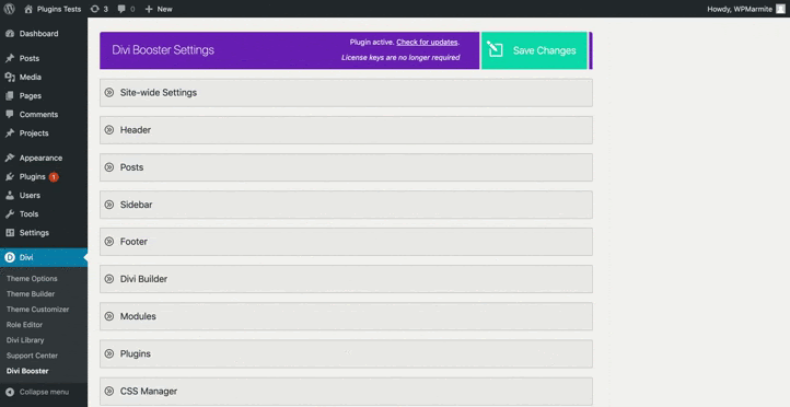
The developers of Divi Booster created it with the comfort of its users in mind.
It is therefore not surprising to discover, after installation, a sober interface and crystal clear about its intentions.

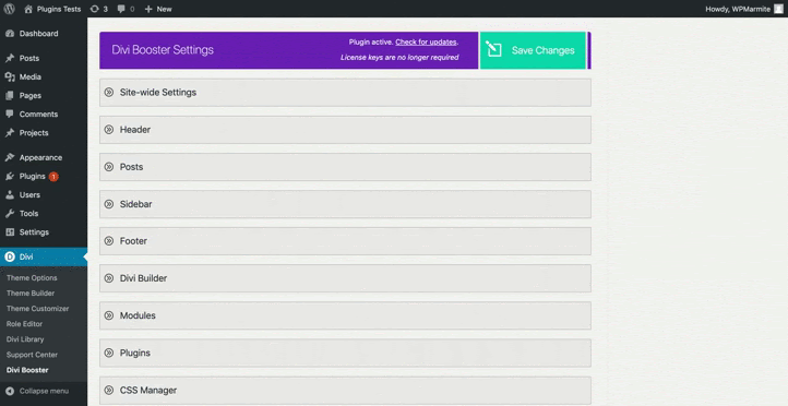
Indeed, the plugin gives you the possibility to make adjustments, both on the more general aspects (Header, Footer, Pages themselves) of your Divi site, and on its more specific features (modules, Visual Builder).
Each of these sections are organized in clickable tabs, under which other sub-categories have a number of options that can be activated/deactivated with a single click:
From a “gadget” point of view, we can mention some options in the Header category such as changing the color on hovering over the menu items, or adding text on the left side of the header.
But for more in-depth adjustments, other functions allow you to generate long-lasting and efficient changes, which will impact the whole website, according to your needs and preferences.
This is notably the case of the icons under the Site-Wide Settings tab, offering the possibility to integrate more than 250 additional social networks, but also to download your own icons and use them with a Divi module, such as the Person or Blurb module.
The original philosophy of Divi Booster should therefore be seen as a toolbox, in which the Divist apprentice can use at will without having to spend hours on endless lines of code.
Pretty cool, isn’t it?
Yes, but here it is: if Divi Booster was able to assert itself as a reference in its field when it was born in 2016, and while Divi’s Visual Builder was still a novelty, the least we can say is that it has now taken a few wrinkles.

Greying interface, superfluous or even useless features, obsolete options since the arrival of Theme Builder, not to mention this strange fetish of dedicating an entire category to all the old options now integrated into Divi and having disappeared as updates are released…


Yes, to say the least, Divi Booster now looks more like a suitcase that’s unpacked when you get back from vacation than a well-organized work briefcase that serves as a support for its user.
So what do we do?
Faced with a competition with features as varied as user-friendly, we could even fear that in the long run, the plugin will simply be abandoned.
Not enough to make the security of your website sigh with pleasure.
So, is the grass greener next door?
I’ve chosen for you the three most popular and best represented plugins on the web in the tradition of Divi Booster, all premium and therefore (a priori) very efficient.
You may even have already seen some of them in advertisements or ads on specialized sites such as Divi Soup, Divi Space or Divi Life.
The opportunity to dig a little behind the scenes of these real virtual Swiss Army Knives: our plugins of the day will be Divi Pixel, Divi Switch and Divi Toolbox.
3 plugins as an alternative to the aging Divi Booster
Although the principle of this article is primarily to highlight the respective qualities of Divi Booster’s heirs, their family resemblance cannot be denied.


And family resemblance means similar or even identical features; that’s why I think it’s interesting to start our test by pointing out their similarities to give you an idea of the “basics” to expect.
On the Global side
- Downloading images in SVG format
- Insertion of a preload animation
On the Header side
- Hover animations for menu items and scrolling logo change (except Divi Switch)
- Transformation of one of the menu items into Call-To-Action (very useful for the conversion of your visitors, whether you are selling a product or a service)
On the Footer side
- Customizing the Back to Top Button*
- Adding a section before and/or after the default footer on the whole site, importable directly from the Divi library depending on what you have added (modules, rows, sections, etc.)*
* Note that these options are now obsolete since the arrival of the Theme Builder. It is however possible to use them if you ignore the Theme Builder and prefer to remain “old-school” in your use of Divi.
On the Mobile side
- Logo change on mobile phone
- Animation of the hamburger icon for the menu
Ready to see what these 3 plugins have in store for you? Let’s go!
Divi Pixel
Tabs: General – Blog – Social Media – Mobile – Modules – Layout Injector – Settings
Divi Pixel hides its game well. Behind its apparent simplicity, and its categories placed in a simplistic looking sidebar, this plugin actually has a very complete panel of options.
If it only offers what is necessary in terms of general functionalities, its offer in terms of modules is perhaps the most complete compared to its competitors.
Unlike Divi Toolbox and Divi Switch, where all the work is done from WordPress administration, the modules are directly accessible via the Visual Builder in the manner of Divi Supreme (another excellent plugin with a free version).
The user experience offered by Divi Pixel is all the more fluid and spontaneous!
Another interesting feature: the traditional generic Header&Navigation and Footer tabs are “arranged” in a tab soberly entitled General.
We can assume that the purpose of this approach is of course to differentiate from competitors, but also to highlight other tabs usually less explored, including Layout Injector and Settings.


Bright idea? We’ll see about that:
Divi Pixel’s pros
- Its clear and concise navigation, which never gives the impression of “drowning” in superfluous functionalities, in particular thanks to the layout of the categories in a sidebar, and not an umpteenth horizontal menu.
- Since we just mentioned the UX (the tool layout) of Divi Pixel, let’s also praise its UI (the design), whether it’s the drop shadows on the buttons, the appearance of fade-in options when scrolling, or the enlargement of the category icons when hovering.
- The clarity of the texts makes it very easy to get to grips with the plugin.
- One of the most important aspects of Divi Pixel is its impressive library of modules, which can be used via the Visual Builder: before/after slider, animated writing module, image accordion, flip box, price list… the possibilities are simply impressive!
- Updates are frequent and do not hesitate to spoil its users.
I even learned, while writing these lines, that the developers of the plugin had just added two modules to the Plugin, namely the Pixel Panorama and a progress bar. This quality represents a strong point, which could, in the medium term, undermine the credibility of the competition, which tends to rely a little (too much) on its achievements.

The cons of Divi Pixel
- Some of the suboptions that can be displayed at the click are not always relevant. For example, if you click the Enable Custom Mobile menu Style option found under the Mobile tab, a single sub-option that displays the menu in full screen appears. Even if they are then customizable from the dedicated WordPress tool, one wonders about the interest of adding this type of interaction for a single sub-option.

- If the number of modules included in the plugin is more than satisfactory, the possibilities offered by the other tabs leave us rather disappointed. Some additional features would not have been too much.
- I would have liked to see the Settings section placed separately in the administration, instead of finding it in the middle of other categories, so as to “adjust” the admin aspect of the plugin before getting my hands dirty. Too bad, the UX was almost perfect!
Those eye-catching features: At the risk of repeating myself, Divi Pixel is a bit of a module crazy fest. In addition to those mentioned above in “The Pros of Divi Pixel”, let’s add to them (for fun!) a picture accordion module, a star rating system and … many others. Not to mention the regularly updated list of upcoming modules, such as the “filter grid” module for blogging addicts, which could replace other excellent plugins such as Divi FilterGrid, which I’ve had the pleasure to use in the past.
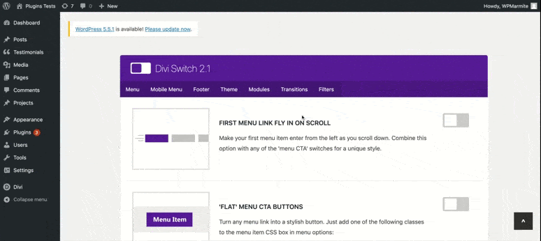
Divi Switch
Tabs: Menu – Mobile Menu – Footer – Theme – Modules – Transitions – Filters
If Divi Pixel has decided to play the simplicity card, Divi Switch is the king of minimalism.
Just like Divi Toolbox, the tabs of the little offspring of our friends from Divi Space are presented in a horizontal menu, but they are nothing but … anchors!
You can therefore easily access several options related to one of the categories, not only by clicking on the tabs of the menu, but also by clicking on the scrolling of the page.
This conception of ergonomics will delight as much as it will displease, since some will appreciate the fact of being able to review the totality of the functionalities of the plugin with a simple index stroke on the mouse, while others will regret the absence of a more “hierarchical” structure.
Clean is the watchword for Divi Switch. Presenting its features to the scroll implies that these are not legion, as navigation could quickly become indigestible!
An ideal tool if your web project requires only a small number of options that Divi Switch will be able to honor, but more problematic if your needs are more substantial.
Divi Switch pros
- Divi Switch’s main added value is clearly its collection of CSS animations that can be easily applied to sections, rows or modules of your choice by simply inserting a CSS class on them.
- A very nice detail is the illustration accompanying each of the listed options, making Divi Switch the most visually explicit plugin in terms of what it has to offer.
- Navigating by scroll and/or via an anchor system is a principle that I personally appreciate a lot. This can be very reassuring for designers who tend to be quickly overwhelmed by too many options.
The cons of Divi Switch
- Less useful and relevant options unfortunately recall some of the somewhat superfluous features of Divi Booster. I’m thinking in particular of the removal of the default blue border of the menu or the footer, which can easily be removed with simple lines of CSS, with display:none and a minimum of good will.
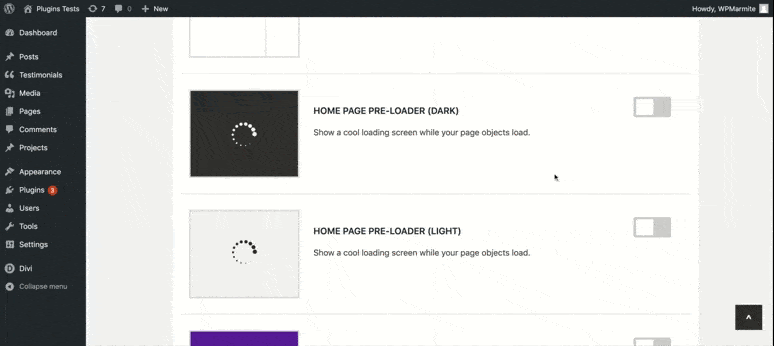
- The plugin is clearly very limited in what it offers and some options are redundant: for example, it is possible to activate a preloader on a “dark” or “white” background, but these two options each occupy a row when they could have simply been grouped together.
- If we’re going to talk about the preloader, let’s talk about the limits of the plugin in terms of variables. The preloader has only one icon, contrary to those of Divi Pixel and Divi Toolbox, which offer nearly twenty. Most of the other Divi Switch options are about as limited. Minimalism we tell you!
- Animations, although interesting, are now easy to implement with Divi’s native animation options. They are still enjoyable.
- No features for social networks, which are one of the spearheads of Divi Switch’s alter-egos!
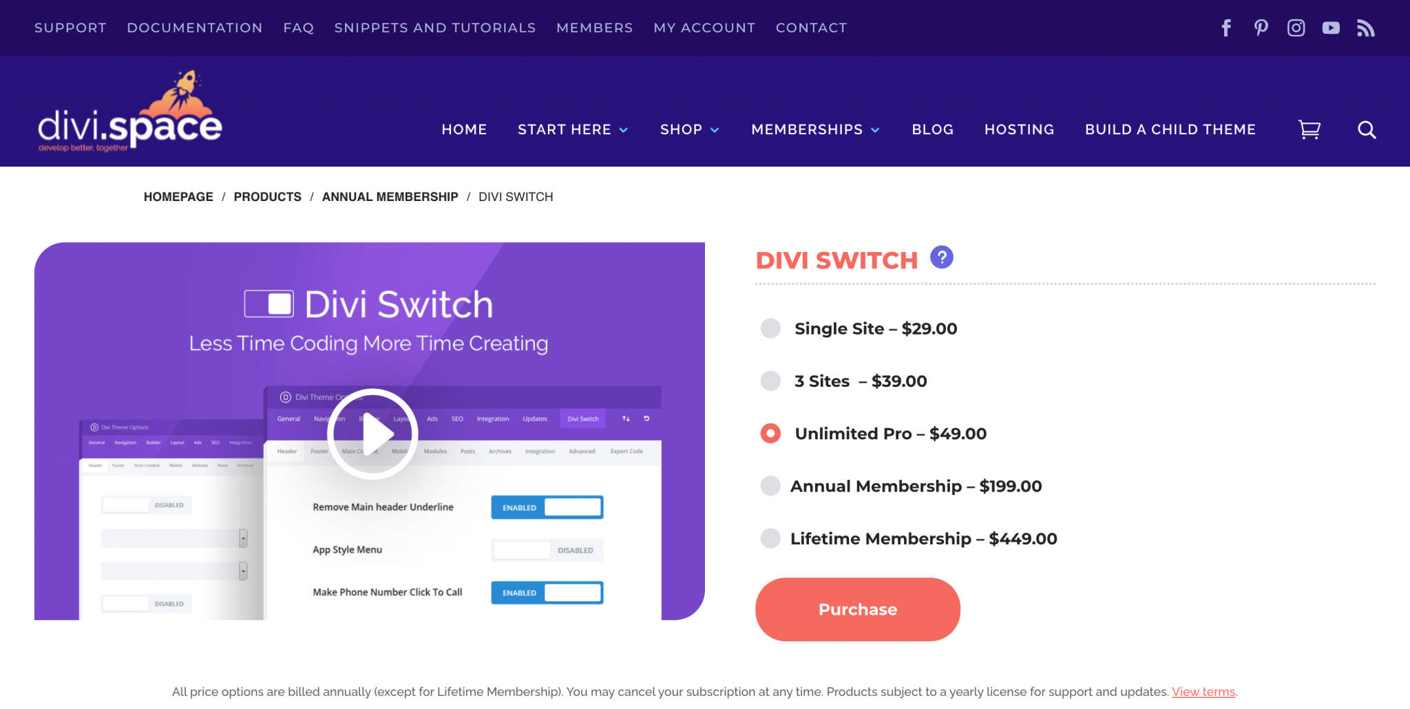
- The lifetime license costs the modest sum of $449 on the developer’s site. This is unfortunately the cheapest offer of our trio of plugins… to say the least.
These features that catch the eye: Divi Switch likes to promote its specificities on all boards … sometimes risking a small lack of consistency. Some animations on the overlays of the projects (we are still in ultra-specific), several layout options for the portfolio module (in square, “book” or movie format), a handful of interactions with the icons found under the summary modules (enlargement and rotation) and most importantly, the large bank of CSS transition effects at hovering which has nearly thirty animations. To do so, you will just have to add the name of the desired CSS option in the CSS class of the section, row or module of your choice. It’s a lot of fun!
Divi Toolbox
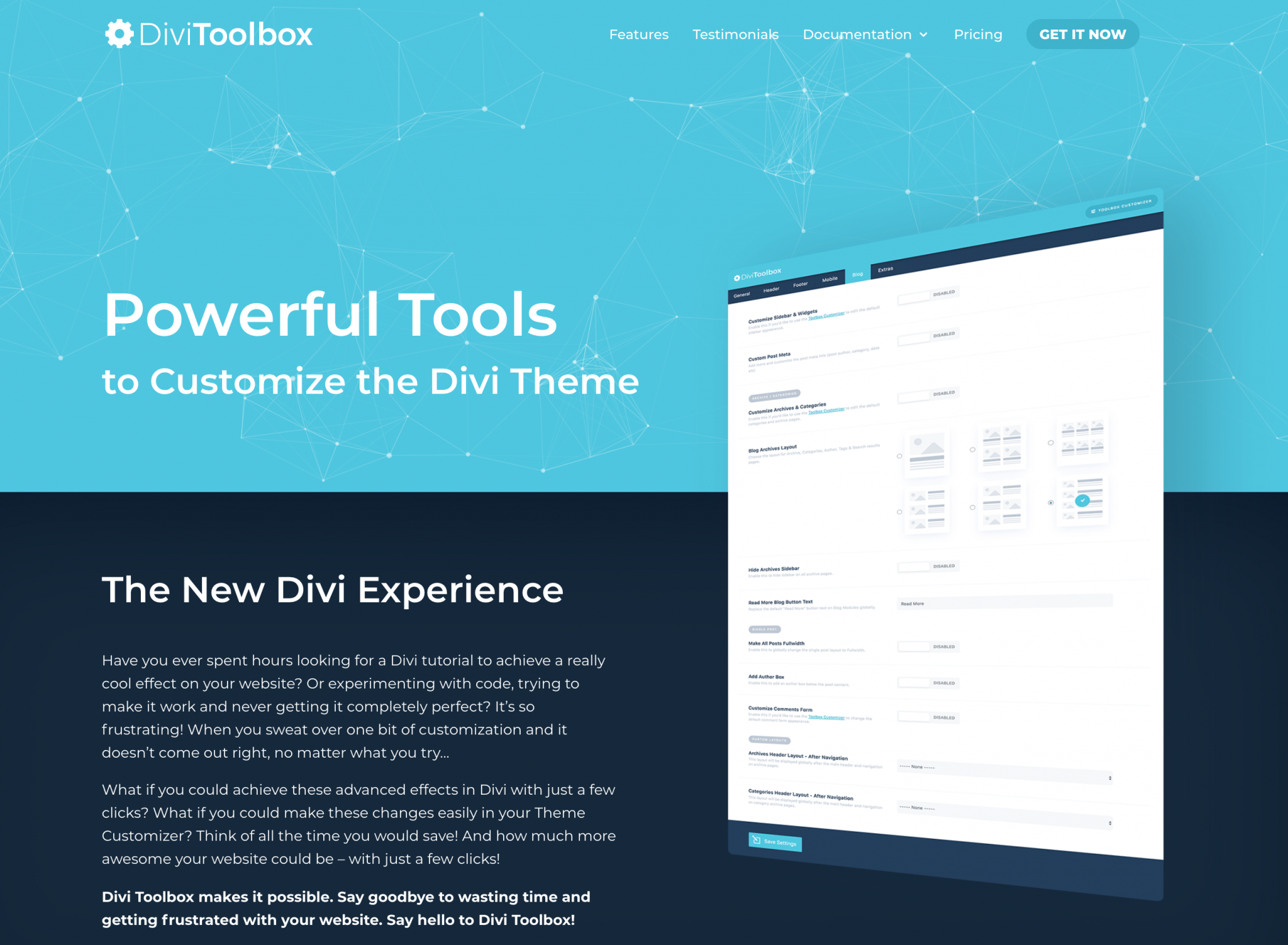
Tabs: Admin – Global – Header – Footer – Mobile – Blog – Modules
Well, since I don’t appreciate pretense, I’m not going to go off on a tangent: I’ve saved my little favourite for you for last.
Divi Toolbox couldn’t be better named.
From its generic functionalities to its modules and its interface, I have a hard time finding even a semblance of a shadow in the picture.
This plugin is in my opinion the dream companion for anyone who wants to develop a website with advanced features without breaking a sweat after hours of intensive research.
The pros of Divi Toolbox
- An optimal category hierarchy. Divi Switch and Divi Pixel may have taken the decision to cut their tabs in an original way, the categories of Divi Toolbox remain in my opinion the best organized to work on your site in an intelligent and progressive way.
- Clear and concise explanations for each feature activated. For most of the options you will click on, a small insert will appear with an explanation of 2 to 3 lines usually indicating the name of the class to add to activate the option concerned. Most of these classes are ready to use: you will have nothing else to do but add them where you want. A delight in terms of user experience!

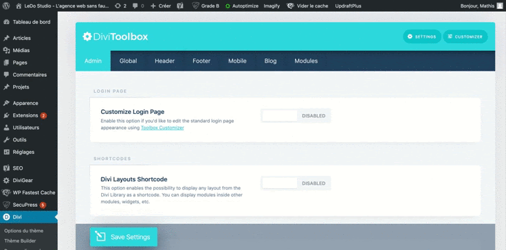
- A variety of impressive options: from technical to pure aesthetics, nothing is left to chance, whether it’s making your site fully responsive by spending less time in the Visual Builder, or adding that “particle” effect in the background of a section that has been making your eyes pop for some time now.
- By far the best offer on the market: a lifetime license for €169 (± $199), you could almost call it philanthropy!
- We can never say it enough: a handful of good testimonials on a web page can make all the difference. The Divi Toolbox website is full of laudatory reviews, and among them is a very complimentary comment from one of the best Divi trainers on the web, I named Josh Hall! Here is a real quality one.
The Divi Toolbox limit
- Since no one is perfect, let’s perhaps point to the rather limited number of options on the module side, more limited than its competitors. An automatic write option here, the addition of a secondary button there: we must admit that the possibilities on this side are a bit of a duel.
These features that catch the eye: As we said, Divi Toolbox is especially characterized by its hybrid character and adapted to any type of use. Still, it can boast some unique options over its competitors, such as the addition of a background of animated particles, customization of the scroll bar, the possibility to insert sticky elements wherever you want on the page, and even pop-up inserts that can be activated using a simple ID to be inserted as a link on a button, menu item or text module. A racing beast, this Divi Toolbox!
Which plugin for whom?
Here’s a good overview of the three best Divi plugins on the market, both in terms of their similarities and differences.
With so much information, it’s natural to wonder which plugin seems most appropriate to start your next Divi adventure.

Of course, this will depend on various scenarios that I have listed below:
- You want to put the rubber on modules that “click”, and make your site stand out visually? Opt for Divi Pixel and its countless advanced modules. As a reminder, most of them are similar to those of Divi Supreme (mentioned earlier in the article), which offers some of these modules for free.
- You need to make a few basic adjustments to your website without getting too much out of your head, all with a few nice animations? Divi Switch will satisfy most users in this situation.
- You like versatility, and would like to combine some of the qualities of the two plugins mentioned above? Divi Toolbox is the place to go, offering a good compromise between Divi Switch and Divi Pixel (without being as minimalist as the first one, nor as complete as the second one).
In short…
It goes without saying that if Divi Booster ever shone, the sacred flame was extinguished.
Just have a look at its anarchic and hazardous documentation on the developer’s site, full of duplicated content and sometimes nonsensical text, to get an idea.
But let’s give credit where credit is due: Divi Booster has the merit of having, like a messiah, paved the way to the superb plugins we have tested in this article, whose use will delight the most demanding Divists.


And if their handling is so easy to use and efficient today, it’s thanks to the innovative approach that Divi Booster initiated 4 years ago on the Divi planet.
So all you have to do is choose one of the three heirs that Divi Booster has created: the versatility of Divi Toolbox, the minimalism of Divi Switch or the completeness of Divi Pixel.
And what’s your “toolbox” so you don’t have to worry about technical details before you start a project? Unless you prefer a more traditional approach by coding yourself?