Apple, Amazon, Mercedes or Nike. All these great brands have at least one thing in common: they all have a very strong visual identity that makes them recognizable among a thousand.
Take their logo, for example. I’ll put my hand in the fire if you don’t see it in a second for each of them. So, do I burn myself?

Behind all this beautiful visual mechanics that is mechanically printed in the brains of consumers and Internet users, we very often find an unavoidable document.
A document that graphic designers and web designers do not hesitate to call ” Bible”. Hum, just that. Sweet Jesus.
This document is the website style guide. In this article, you will learn how to create one with little onions, thanks to a step-by-step tutorial full of tips and practical advice.
You could come across other names such as brand identity, style guide, brand guide or visual identity – and others – but in this particular case, we’re going to talk about a website style guide which is about a website and not a brand.
Because various design disciplines have to interact with them, you may have heard about web design style guides under different names: pattern libraries, UI toolkits, front-end style guides, human interface guidelines, UI guidelines, among many (many!) others. No matter how you call them, remember this: Your web style guide contains essential building blocks for anyone in charge of constructing your online properties.
Source: Canva’s article about style guides of different brands
The idea? Put yourself in action immediately without asking yourself questions. The goal? To get your visitors in the spotlight, like Apple and others. And believe me, it’s possible, even if you’re starting from scratch. Follow the guide.
Overview
This post contains some affiliate links. What doest this mean? Simple: if you purchase a product or service via these links, WPMarmite will receive a commission. The price remains the same for you but you help us rewarding our blog’s writers. You win, we win, win-win…
What is a website style guide?
A website style guide is a working document of several pages that includes the major elements of your visual identity (logo, colors, typography, visuals etc.), as well as their rules of use on the web and on paper.
Its main goal is to guarantee an optimal coherence in your visual communication, while solidifying your brand image.
We tend to be confused with several distinct, yet complementary elements:
- The editorial guidelines: this is a document presenting the rules for producing a company’s content (editorial line, target audience, rubrics, style rules, SEO strategy, production process, etc.). It is mainly intended for web editors.
- The corporate/brand/visual identity. A clear definition is given to us by Wikipedia: “Corporate identity is the set of multi-sensory elements that marketers employ to communicate a visual statement about the brand to consumers. These multi-sensory elements include but are not limited to company name, logo, slogan, buildings, décor, uniforms, company colours and in some cases, even the physical appearance of customer-facing employees.”. In summary, let’s say that the elements of the corporate/brand/visual identity (logo, colors, typography etc.) are presented and implemented in a global user manual: our famous style guide.
- Brand image refers to the way a brand is perceived by a consumer, in particular through the elements that make it up (logo, colors, text content etc.).
I hope this is a little clearer for you. In order to make it more concrete, I have found some examples of online style guides (thanks to this site which lists some of them).
The idea here is to give you a first glimpse. We will then develop in detail the components of an awesome style guide.
In the meantime, here are a few snippets:
- Skyscanner style guide:

Find more details directly on Skyscanner’s website.
- Copper style guide:


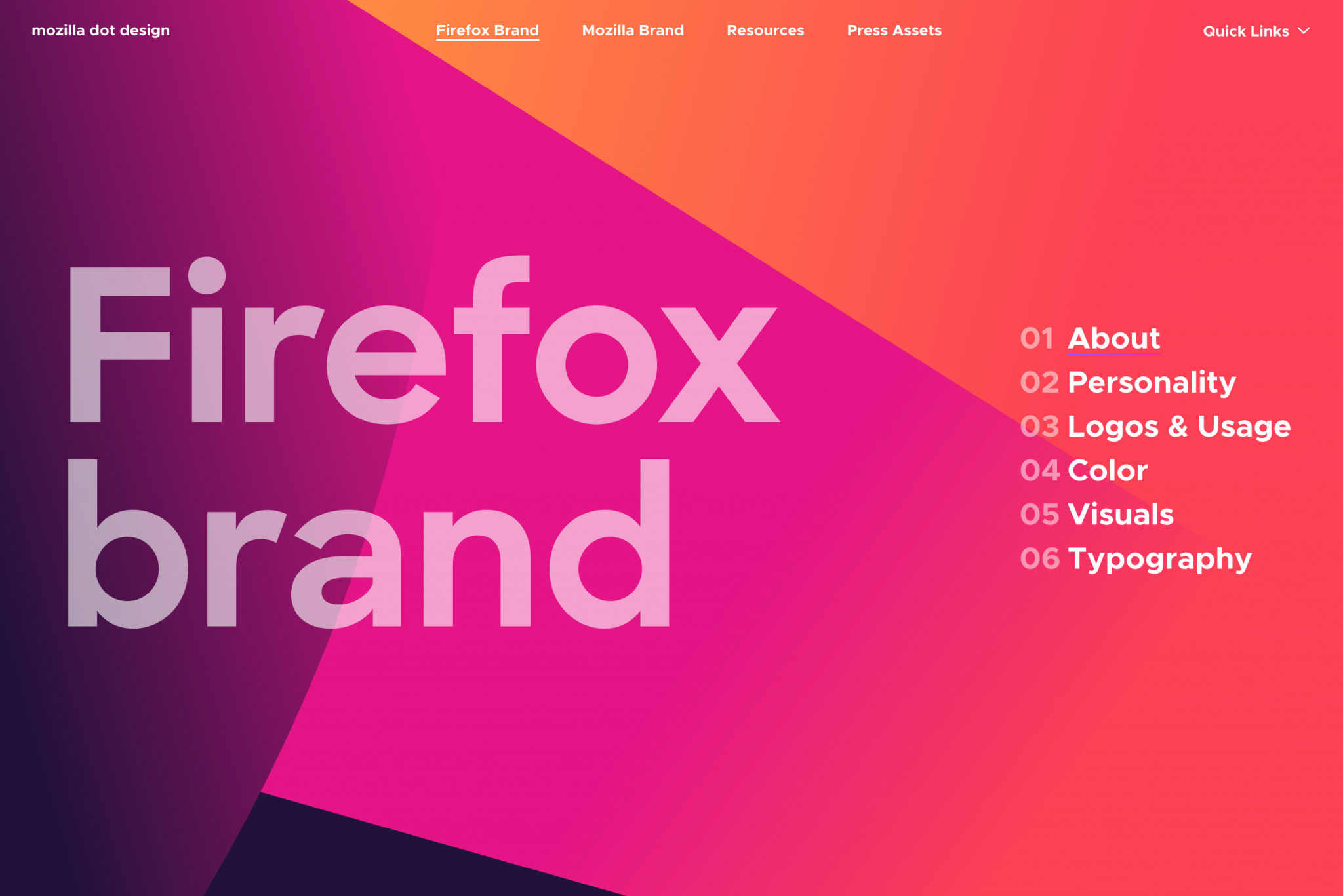
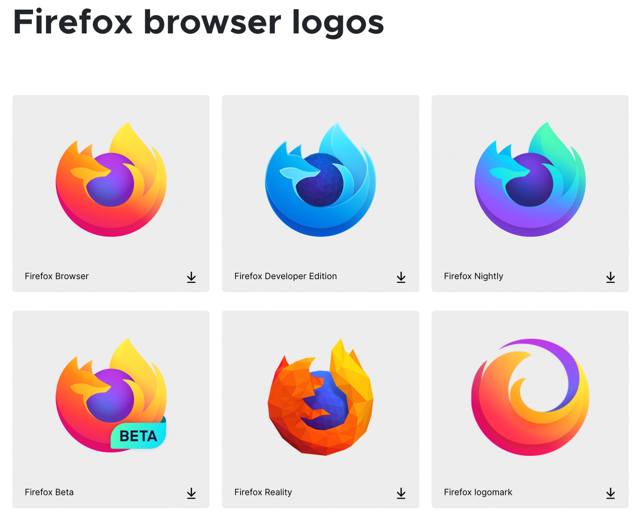
- Mozilla Firefox style guide:

We can also think of design systems of large companies like Google, for example.
But in this case, we often go in more depth than with a style guide, since the components, for example, are even detailed.
Read more of Nathan Curtis posts about design systems if you wish to learn more on this topic.
Why create a style guide?
After this appetizer, one question may be burning in your mouth: by the way, why create a style guide?
It’s essentially a question of “coherence”, as I explained at the beginning of this article. A style guide makes it possible to homogenize and professionalize the visual identity of your website, as well as all your communication supports.
If you take a closer look at it, it’s logical and relevant: if you use a well-defined logo on your home page, you won’t use another different logo on your Contact page. It wouldn’t make sense.
By remaining consistent – I insist on this word – you make it easier for your site visitors to understand your universe, and help them recognize you easily by following a clear guideline.
Because if you start changing colors and logos every four mornings on your website, your visitors are likely to be confused.
Let’s take a musical example to illustrate this. Imagine if Daft Punk were wearing helmets at one gig, then dressed as ducks at the next gig, and finally dressed as cowboys at the next gig: you’d get lost, wouldn’t you?

To remain coherent, Daft Punk never go out without their helmets masks. Let’s say that this dress code is their own style guide. Well it must be the same on your site. You have to propose something uniform, thanks to a website style guide that rocks!
To know how to do this, go to the next part. You will learn how to create a style guide step by step, starting from scratch.
After that, you’ll see: your brand image, your professionalism and your notoriety will grow. And this, whether you are a large company or an individual entrepreneur.
In fact, anyone can benefit from a style guide!

Create your website’s style guide in 6 steps
Step 1: Define your brand identity
Before you get into the swing of things, take some time to think about the message you want to convey through your style guide.
You will see, this will greatly help you to see more clearly in the realization of the following steps.
First of all, take stock of the following elements, trying to detail them as much as possible:
- Your goals through the creation of a style guide for your website. In its own, the Rotary Club details for example that it wants to “apply a new look and a new voice” to strengthen its image.
- Your values, i.e. what guides the operation and development of your website/company. For example, one can think of innovation, know-how, performance, success, etc.
- Your personality: how and why you are recognized. List a handful of adjectives that best define you.
- Your mission. WPMarmite’s mission is to help beginners, freelancers and bloggers set up their sites, customize them and manage them on a daily basis like pros.
In addition to this, don’t forget to think about your target audience. We also talk about audience, or in marketing jargon, persona. A persona is a fictitious representation of your ideal customer.
To build your personas, HubSpot offers a dedicated and very practical tool, if you are interested.
Of course, it is never easy to think about yourself and your own creations. It is often difficult to be critical and have the necessary hindsight to understand all the workings of our activity.
If you’re stuck, don’t hesitate to call on others (a target customer, someone close to you, etc.). A small brainstorming session is never too much and can help you unblock a lot of situations with a blocked horizon.
Is it good for you for this first step? Great! We start right away phase 2 with a first major element of your style guide: typography.
Step 2: Choosing a typography
Presentation of the typography and basic rules
Simplifying greatly, because the term covers several fields of application, typography designates all the characters used on your website at the level of your texts.
By extension, it is also very often referred to as a typeface, or font.
In general, do not use more than 2 to 3 fonts on your website. For example, one for your titles, and another one for your body text. Remember the sacrosanct rule of consistency ;-).
You should also know that some font families are considered more readable on the web. These are sans serif fonts, as opposed to serif fonts:

This criterion is to be taken into account during the elaboration of the style guide of your website.
The size of your font is also very important (we recommend at least 14 pixels on screen). You can use a sans serif font that is pleasing to the eye, but if it is displayed in lower case (e.g. 10 px), it won’t do much good…
An adequate font will be the one that will fit your brand image and your graphic universe.
As you will see just below, each one has its own personality which will not always be adapted to your situation.
Where and how to choose a typography for the style guide of your website?
There are several sites to find the font of your dreams:
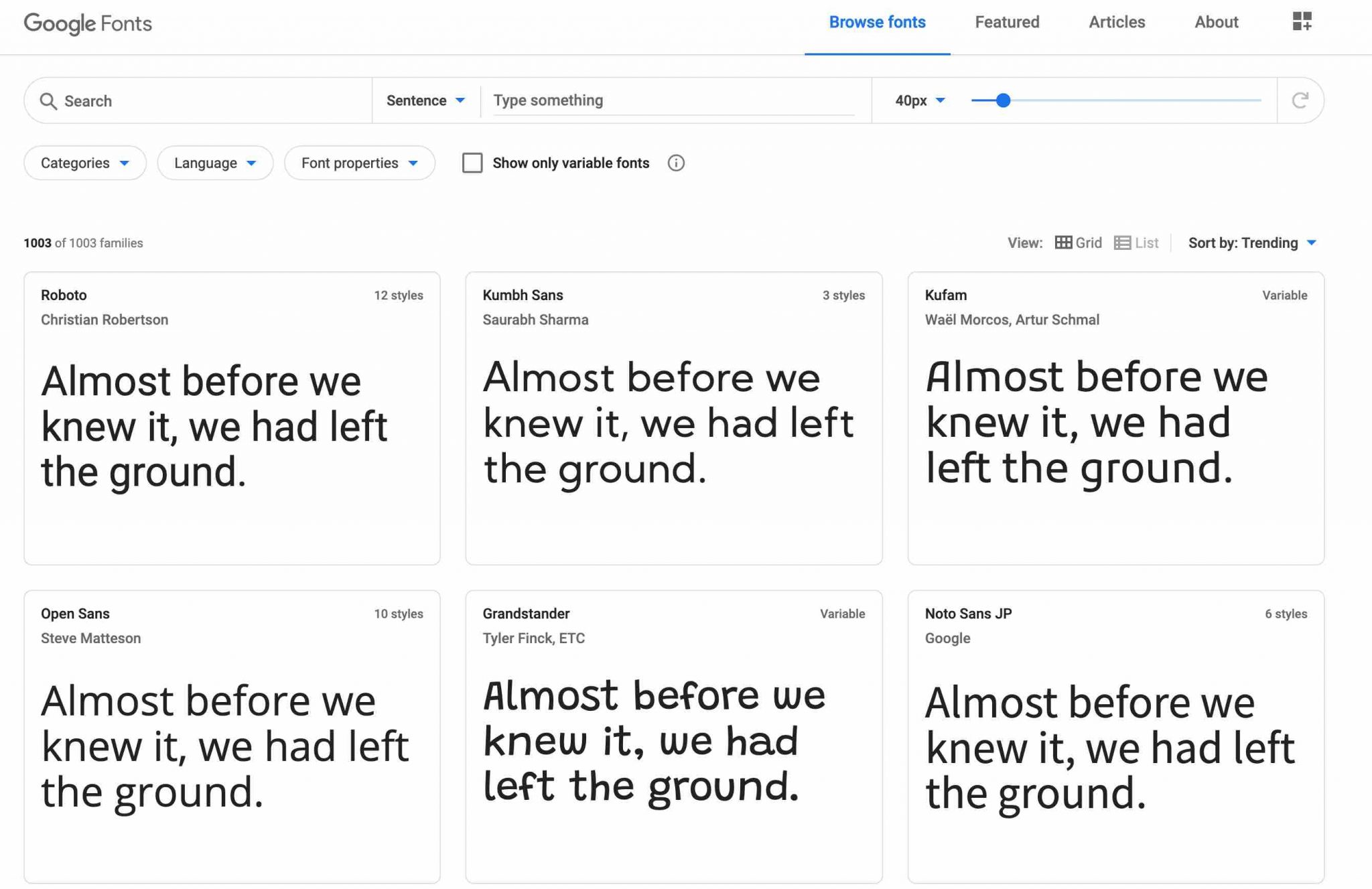
- Google Fonts offers more than 1,000 fonts for free (royalty-free).
- MyFonts offers more than 130,000 fonts (free and paid).
- DaFont offers hundreds of creative fonts, but only free for personal use.
- Font Squirrel lists hundreds of royalty-free fonts (even for commercial use).
After having done a first clearing, it will be important to choose complementary fonts, so as not to spoil everything visually and to keep an optimal readability.
These few resources will be of great help to you in order to match your fonts to each other as well as possible:
Typography in your style guide
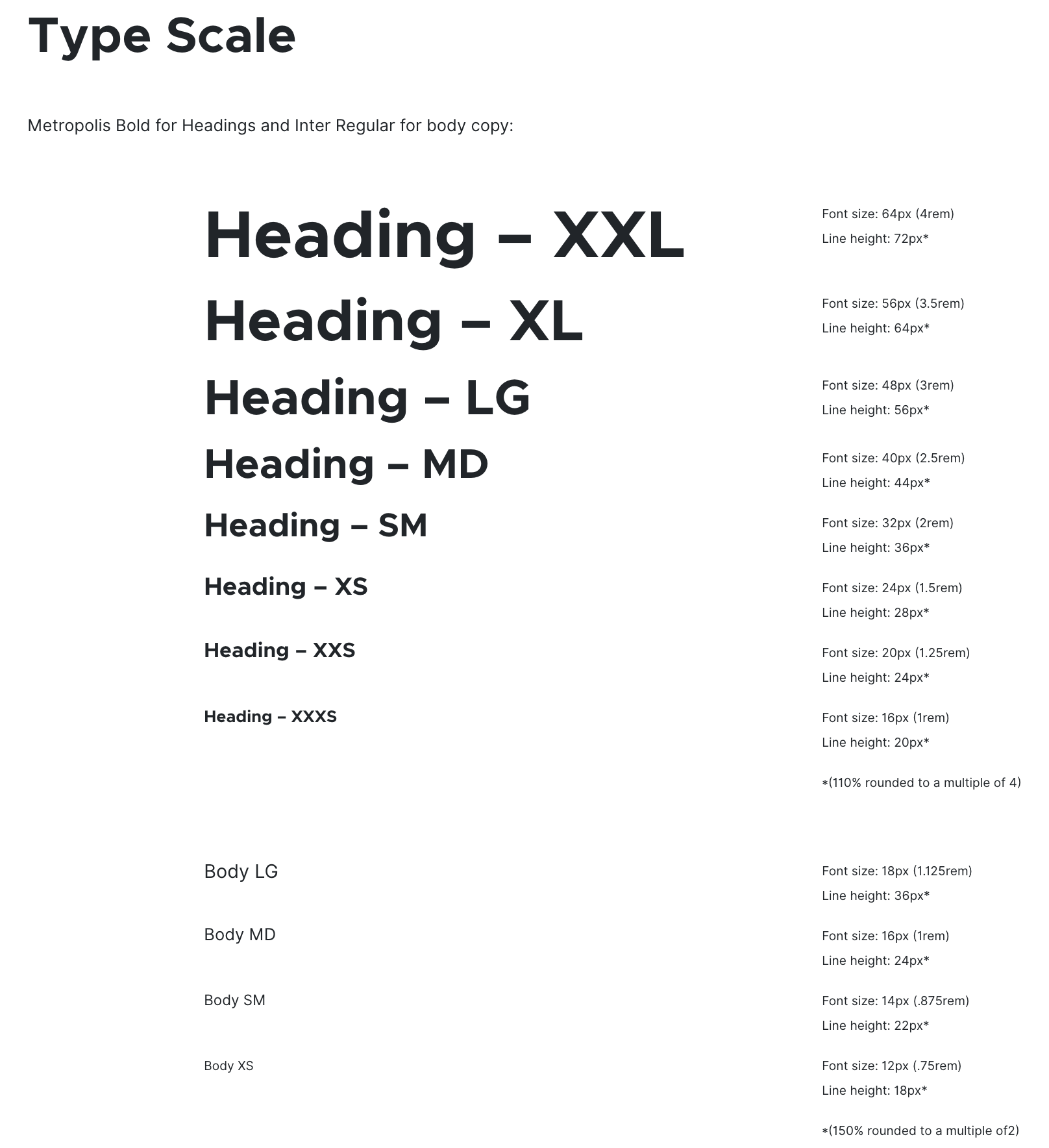
At the level of the style guide of your website, it is customary to present:
- Several declinations of your typography (Regular, Bold, Italic etc.) and their cases of use.
- The typography of the logo (if it contains any) and the one present on your website.
- The alignment and spacing of the typography.
How do I add typography to WordPress?
Presence of your fonts in the style guide of your website: check. To be good to go, think about adding these fonts on your WordPress site
It goes without saying, I know, but it’s not always easy to implement. In practice, it is possible that the theme you are using will integrate fonts to make your life easier. For example, the Astra theme provides you with all the fonts from the Google Fonts library.
Each theme then has its own settings to activate them. Basically, this is done either through the Customization Tool (this is the case for Astra or GeneratePress) or through a custom settings interface.
If the choice is very small and doesn’t suit you, it is always possible to get your hands dirty to integrate these fonts into the code of your WordPress site.
If you’re new to WordPress, using a plugin will be easier and less risky. For example, Use Any Font might do the trick.
Be careful when adding fonts to your WP site. Limit yourself to a maximum of 2 fonts because using them triggers additional requests that can slow down the loading time of your pages. Moreover, combining more than 2 fonts is not an easy task for a beginner.
Step 3: Create a logo for your website’s style guide
What is a good logo?
A logo or logotype is the graphic representation of a brand and a company. Its importance is crucial because it is often through it that we identify a brand first and foremost.
For example, if someone says Nike, I don’t know about you, but I immediately think of the famous comma.
If I say Apple, I bet you will see the famous apple associated with the brand.
Finally, when you think of WPMarmite, you immediately visualize a… pot, don’t you 😉 ?
Apart from your website, don’t forget that your logo can be used on all your communication elements: business cards, commercial brochures, flyers etc.
You must therefore design it with the utmost care. For it to be successful, it must combine several qualities:
- It must be easily recognizable and memorable.
- It must be unique. If your freelance neighbor has exactly the same one, it is difficult to stand out.
- It must be simple. It is well known, “the best is the enemy of the good”. For your logo, keep it simple and concise.
- It must be adaptable to all your media, both on your website and on paper.
- It must be legible.
Where and how to create a logo?
Designing a logo that rocks for the style guide of your website is not easy, especially if you have no knowledge of webdesign.
To help you, there are several free online sites that will take you by the hand:
Not bad to start without spending too much money, but it’s hard to stand out with this kind of logos. They are often cold, impersonal and not very creative.
For a unique and professional rendering, I advise you to turn to a specialist in graphic design and/or webdesign.
You can either go through an agency, or contract the services of a freelance (often less expensive) through a dedicated platform such as Malt, Upwork, etc.
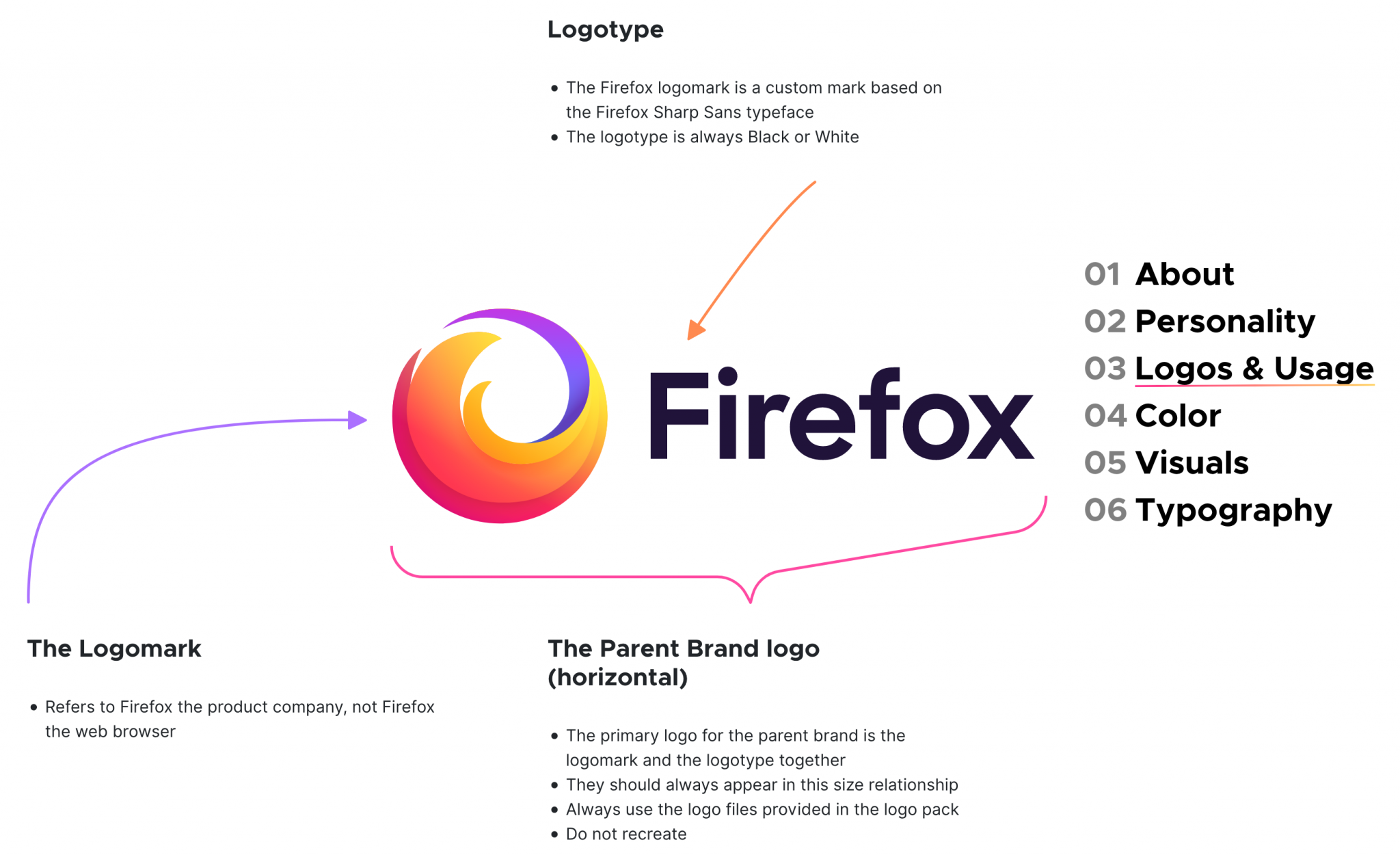
Logo and style guide: what exactly are we talking about?
Once your logo has been created, don’t forget to integrate it into your style guide. You can specify the following elements:
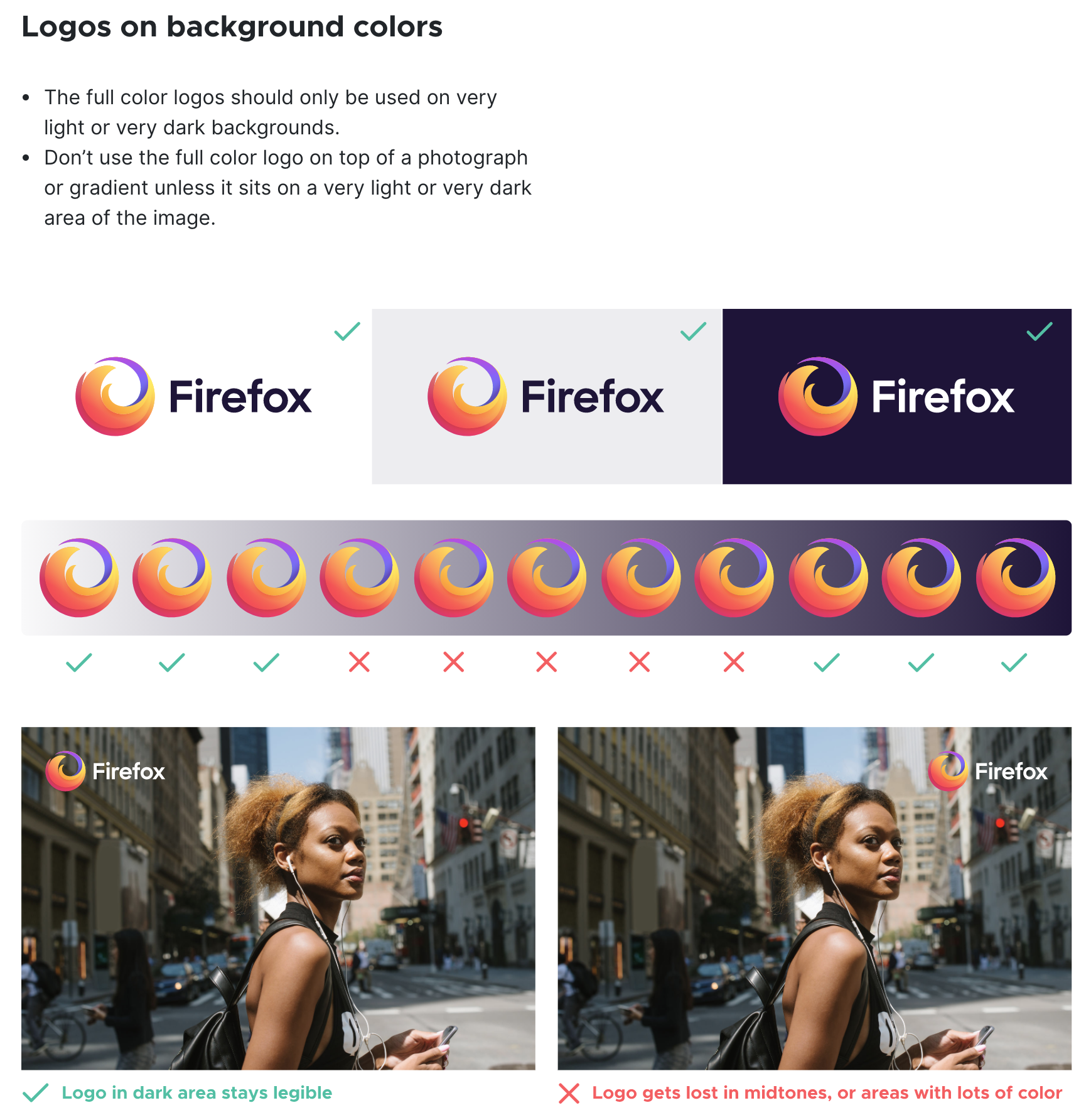
- Presentation of the logo in color AND monochrome (black and white), with its associated color codes: CMYK for print (Cyan, Magenta, Yellow, Black), RGB for the web (Red, Green, Blue).
- Its meaning and its format of use (e.g. horizontal and vertical) and its context (e.g. such version on such type of support, such other version in such other case).
- The display of protection zones, i.e. a space in which no graphic element must penetrate, so as not to alter the correct perception of the logo.
- The minimum size of the logo.
- Its integration in an image and on a colored background.
- The prohibitions (e.g. do not shrink only its width, which could distort it; do not change the typography).
How do you add your logo to WordPress?
Once you’ve created your new logo and integrated it into your style guide, don’t forget to upload it to your WordPress site.
To do this, use the Customizer through the Appearance > Customize > Site Identity menu.
And while you’re at it, by the way, add a favicon (site icon, which you can find in illustration on the tab of your browser).
Step 4: Define colors
After the logo, it’s now time to stop on another important element to include in your style guide: colors
Here again, their choice should not be made carelessly. Just because you love candy pink doesn’t mean you have to spread your website in that color.
It may work in some cases, but I would advise you to focus on consistency – again! – rather than on your frantic love of pink.
Why the choice of reason? Simply because colors have a meaning and must serve your purpose to best illustrate the message you want to convey.
For example, red is associated with love, passion, power or blood. It is often found in several specific fields: gastronomy, catering, sports or humanitarian work.
But beware: red is also associated with error messages when it comes to web conventions!
The color green is associated with nature, ecology, plants, growth, or sharing. It is therefore not innocent to see this color on sites related to nature, travel and the environment.
Do not take these two examples as a rule to be applied absolutely. If your activity revolves around gastronomy, you don’t have to use red everywhere.
It’s good to have it in mind so you don’t make any mistakes, but it’s just as crucial to mix the colors you choose together.
Where and how to choose your colors?
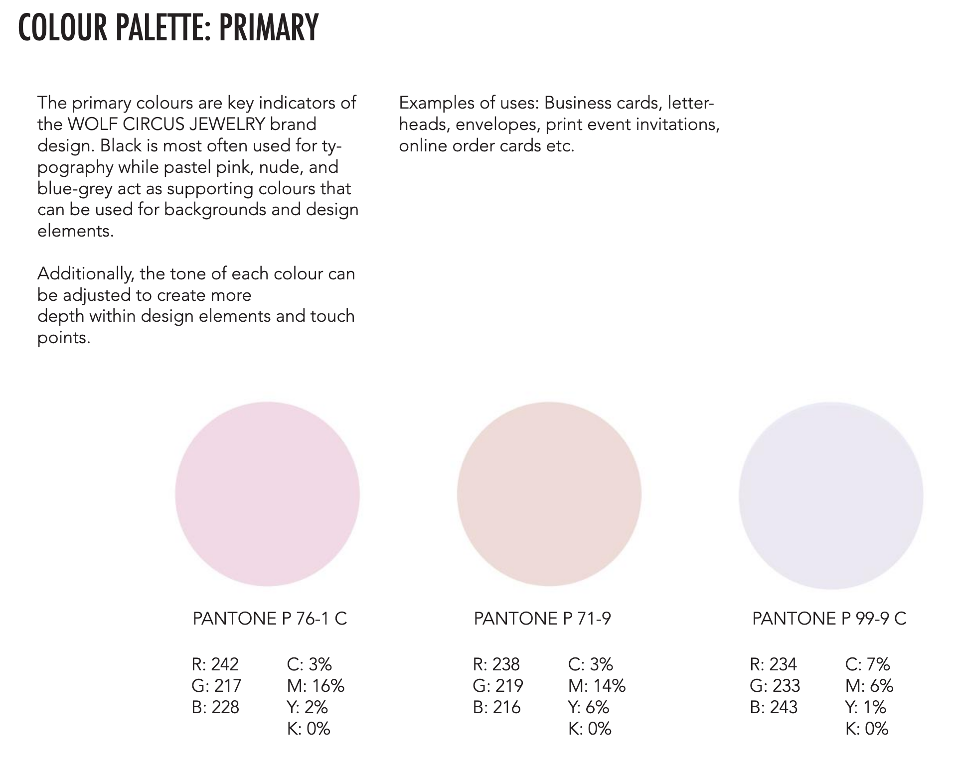
To help you in this task, first limit the number of colors you will use to 3 or 4:
- A primary color that can be found for example in your logo.
- Two secondary colors.
- Possibly a complementary color.
It may seem not enough and frustrating to you, but it’s better not to get too far with it!
To mix these colors together properly, I have what you need. Go and have a look at the following resources:
With this handful of free tools, you will no longer have any secrets about color matching.
And if you’re short on inspiration, check out what your competitors have to offer, and don’t forget to check out Pinterest.
You can often find a lot of nuggets there. Plus, Pinterest can help you attract more traffic, as explained in this article.
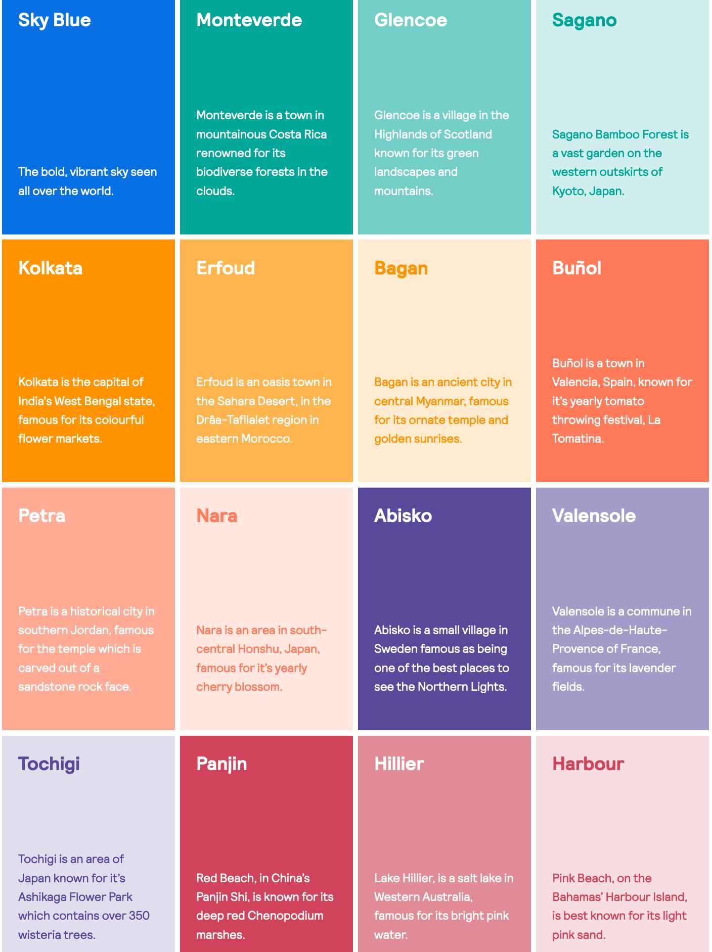
What should your website’s style guide contain in terms of colors?
Once your palette is ready to use, take out your brushes and draw your style guide. Include the following references:
- The information related to the digital colors (for a display on screen). We are talking about RGB (Red, Green, Blue) and HEX (the hexadecimal color).
- Note that for a print chart, you will have to include information concerning the color references, i.e. the name and the PANTONE number. But also the information relating to the colors for printing, the famous CMYK (Cyan, Magenta, Yellow, Black).
In addition, nothing prevents you from listing good and bad practices in the use of your colors, supported by visual illustrations.
Where and how to add them to WordPress?
Now you know the deal. It’s time to add your beautiful colors to WordPress.
Again, there are several ways to do this, depending on the plugins and theme you use:
- Depending on what your theme allows, you’ll be able to make global settings from the Customization Tool or a theme-specific settings interface.
- If you use a page builder, you will be able to directly change the colors of your elements (text, links, background etc.) by clicking on the element in question. It is even possible to do this from the visible interface of your site with page builders such as Elementor or Divi.
- If you have technical knowledge of CSS, nothing prevents you from making adjustments through the code.
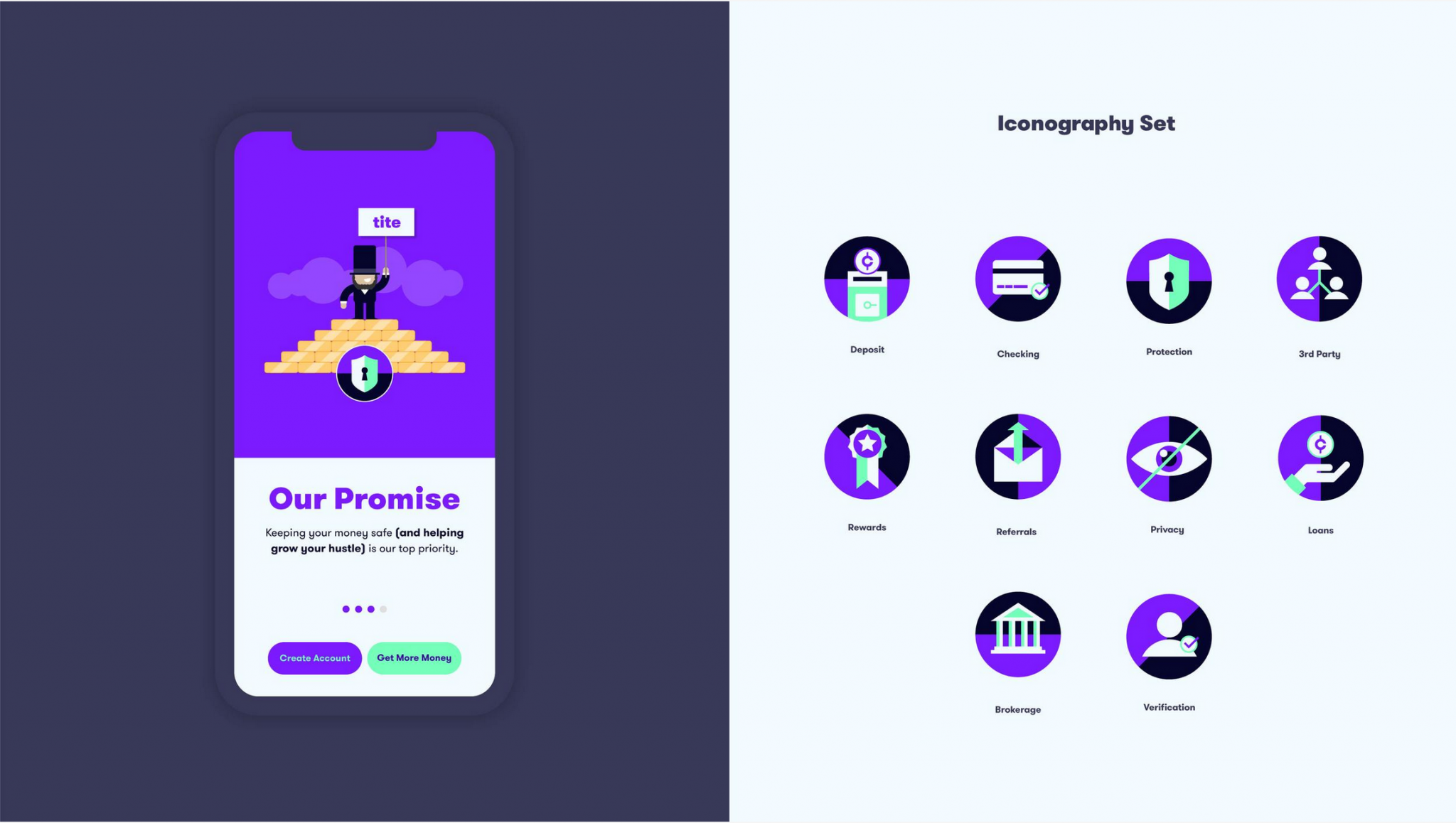
Step 5: Take care of your visuals
If you will not find this part in all style guides, presenting your visual guidelines (photos, illustrations, icons) is still interesting to illustrate the ideas and concepts you want to convey.

You can also specify the rules regarding framing, background, brightness, as well as the pitfalls to be avoided (e.g. avoid using filters).
Presenting examples of images that match your expectations will obviously be welcome. The gymnastics is the same for the icons, which will have to blend in with the universe of colors that you will have chosen.
You can either create them yourself, or get them on dedicated sites such as Iconfinder, Flaticon or The Noun Project. Be careful however with the rules of use and the copyrights. All these icons are not necessarily royalty-free.
For the photos, use your own pictures for more originality. If you are short of stock, you can get your pictures from royalty-free image banks. We counted about ten of them in this article.
How do we do it on WordPress?
And to finish this part, a little note on WordPress doesn’t hurt. To add your photos on your site, go to the Media Library. Nothing difficult, you’ll agree.
But don’t forget to give an explicit name to your file and to fill in the alt tag. And of course, optimize the weight of your images, for example thanks to the Imagify plugin.
Finally, here are two nice plugins to help you organize your files in folders: HappyFiles and FileBird. Very handy when you find yourself with hundreds of photos in stock.
Logo, typography, colors and visuals: you have all the tools you need to create a style guide that works. If you use communication media other than your website, it is also useful to present them in your working document.
Step 6: The situation (and applications)
For an even more global overview, you can also present variations of the visual elements of your style guide on different media:
- Corporate stationery: business cards, notebooks, loose sheets, etc.
- Office documents
- PowerPoint presentations
- Vertical and horizontal posters
- Leaflets
- Information boards
- Press kits and press releases
- Clothing and accessories: t-shirts, caps, mugs

Which tool/software should be used to create a style guide?
On the content side of your style guide, you are normally ok now. On your way there is one last obstacle: to put all this amount of information into shape.
And let me guess: you may be wondering what tool/software to use? You’re quite right and rest assured, there’s plenty to do. You can use:
- A must-have for the Adobe suite (for a fee), especially InDesign and/or Illustrator. The latter two are very often favoured by graphic and web designers, but they are not alone, just like Frontify.
- There are also free – but less powerful – alternatives such as Scribus, Lucidpress and Canva.
- If you search on your favorite search engine, you will also find that some of the tools that specialize in logo creation, such as Logaster, also offer to help you create a style guide.
- Not forgetting a good old HTML document that will allow developers to have direct access to certain styles.
For the design and formatting of your style guide, don’t hesitate to browse specialized sites such as Behance and Dribble, which are full of very successful examples.
There is no pre-established length for a style guide. It is usually in PDF format and can be between ten and a hundred pages long. It all depends on your needs and what you want to put inside, in fact. As a rule of thumb, keep it short and simple when sticking to this exercise.
Creating a style guide: the debrief
Throughout this article, you have discovered that it is composed of several major elements such as the logo, the colors, or the typography.
Even if you are a beginner and your knowledge in webdesign and graphic design is limited, you have seen that it is within your reach to create a style guide that respects itself. On the other hand, it is undeniable that it will cost you a significant investment of time.
If time is a scarce commodity for you and you are looking for an even more professional result, you can also hire the services of a graphic designer or a webdesigner (agency or freelance).
The price will essentially depend on the size of the project and the time spent to design your style guide. Prices on the market are very disparate and it is very delicate to give you a precise range.
It depends on the history of the company, the competition etc. It is also difficult to provide only a style guide without having to investigate the company, the product, the UX of the product, the site, etc.
Just to give ou an idea (but that is JUST an idea), it seems that one would have to count on average between $800 and $5,000 for a “classic” style guide designed by a freelancer.
From now on, the floor is yours. Do you have a style guide? Or maybe you plan to start after reading this article?
Give us your feedback and share with other WPMarmite readers any suggestions for improvement.

Receive the next posts for free and access exclusive resources. More than 20,000 people have done it, why not you?

Continue reading
Articles posted in WordPress TipsWhat type of website should you build for your project? The guide to making the right choice
You want to create a website, but you’re not quite sure where to start? Don’t worry, that’s completely normal. When starting a web project, most people don’t realize just how many different types of websites exist, each designed to achieve…
How much does a WordPress site cost in 2026? A guide to setting your budget
$1,000 on your left. $4,300 on your right. And do you remember that one day you came across an offer to create a site for $7,500 not including tax?! With all these widely differing prices presented online, it’s very difficult…
The Best WordPress Plugins — the Top 25 you can’t do without
. This figure represents the number of WordPress plugins available on the official directory. And I’m not even talking about those on dedicated platforms, such as Code Canyon or independent shops. Do you have a specific need? I’m convinced that…