After several disappointments, you are looking forward to this moment. Tick, tock. Tick, tock. The seconds are ticking away. Suddenly, your evening date is just around the corner.
Bim, bam, boom: in your chest, your heart races. Ah, finally: you like the person you’ve just discovered.
That’s not bad, but it’s not always enough to go further. Sometimes, after a few words, it quickly goes downhill, and you feel like faking a call to get out of a sticky situation.

Moral of the story: during a date, like with a website, you only have one chance to make a good impression (cliché though it may sound).
So, will your visitors click on the links on your menu? Will they want to scroll down your page?
To get them to make the first move, you need to show them one of your best seductive assets: the header of your WordPress site.
If it’s well done, chances are your visitor will want to get to know your site better. If not, they may go elsewhere.
To help you conclude, I give you all my advice to create and customize an attractive header.
Originally written in October 2020, this article was last updated in January 2025.
Presentation of the header and its importance
What’s a header?
The header is the first zone visible as soon as the page is loaded. It’s a strategic area because it gives at a glance all the information that makes up your brand identity (colors, logo, typography, navigation, etc.).

Generally, the top of the page, another name for the header, is the same on all pages of a WordPress site. However, you may also find different headers on some pages.
What elements does it contain?
First of all, you should be aware that it is difficult to find consensus on the exact area occupied by a header.
For some, it is only a navigation bar containing the logo, navigation links, or a call to action. A bit like the Beaver Builder website:

For others, the header corresponds to the upper part of your site located above the waterline (everything that is visible before scrolling). In this case, it represents a much larger space (also called hero-section):

Whatever the case, a good header on WordPress usually contains several essential elements:
- A logo
- A navigation menu
- A call to action (CTA for short)
- The elements representing your visual identity (colors, typography)
Depending on your goals and the nature of your activity, you can also include additional elements:
- An icon representing a shopping cart, if you have an online store designed with WooCommerce, for example
- A button to change language if your site is multilingual
- A search bar, like the one seen here on the popular theme store, Themeisle:

- Social network icons
- Contact information (email, phone number)
- A breadcrumb trail
Of course, don’t add them all at once. Choose only the ones that fit your needs, so that you don’t offer your visitors an indigestible mush.
You should aim to be as concise as possible, while offering useful information that will allow your visitors to understand in a few seconds what you are offering them and giving them the tools they need to complete the task they came to your site for as quickly as possible!
If you’re hesitating, tell yourself that your header should help your reader identify who you are (through your logo, for example), what you offer (with your navigation links) and the action you want them to perform (e.g., call you, reserve a table, download a PDF guide, or connect to a customer area).
Why is this an element not to be neglected on your site?
This clever mix is not easy to obtain, but don’t neglect your header! When landing on your site, your visitors will immediately notice it.
And it is often from the header that they will form a first opinion about you, remember. If it is well designed and meets the expectations of your visitors, you will succeed in attracting their attention and encourage them to continue browsing your page(s).
But to do this, you need to hit hard from the start. In fact, it only takes a few seconds for a visitor to determine if he likes a site…

And if we also take into account that visitors browse less than 15 seconds on average on your site, you have very little time to play your best cards.
A little later in this article, we’ll give you all our tips on how to create a top-notch header on WordPress.
A good header is also the assurance of reducing your bounce rate in order not to penalize your SEO too much, while optimizing your conversions (specific actions you want your visitors to perform).
How do I create and customize a header on WordPress?
After the theory, it’s time to put it into practice. In this section, we detail 5 ways to create and customize your header on WordPress.
You’ll see, you don’t need to know how to code to achieve great results.
Use the Site Editor to customize your WordPress header
If you’re using a block-based WordPress theme (FSE theme), you can use the WordPress Site Editor to customize your header.
To do this, go to Appearance > Editor, click on “Patterns” and then “Header”.

Finally, click on the header you want to edit.
Use the Customization Tool to customize your WordPress header
Not using a block-based theme? No problem, you can customize your header with the Customizer tool. The Customizer, accessible from the Appearance > Customize menu, allows you to make basic settings to your theme in real time.
Basically, here is what you will be able to do at least:
- Add a logo
- Fill in the title of your site
- Include a slogan
- Integrate a site icon, also called favicon. This is an icon (often the miniature version of your logo) that is displayed on the tabs of a web browser.
Note that the location of the various settings depends on the theme that you’re using.
If I activate the Astra theme, for example, the header customization options are in the “Header” sub-menu, which itself contains 4 additional sub-menus with dozens and dozens of options.

For example, you will be able to modify the width of the logo, the layout of the header, the colors, and the background.
In short, if you follow: the header of a site is 100% dependent on the theme it uses.
Using the theme settings
That’s why some of them use the Customization Tool very little, if at all.
For example, this is how Avada, the best-selling premium WordPress theme on the ThemeForest platform, works. In its case, the Customizer only allows you to modify the header image, which won’t get you very far.
With this theme, the customization of your header takes place on a specific settings page available on the administration interface. By accessing it, you can for example:
- Choose among several layouts for your header on WordPress
- Change the position of the header (left, right, top)
- Add social network icons and contact information
- Customize the header style (colors, border, width, etc.)
Getting “support” from a page builder
Beyond the Customization Tool and the specific settings offered by your theme, a header can also be created and modified using a page builder, provided that it allows you to edit this specific area.
This is particularly the case with Elementor Pro, Divi Builder, Beaver Builder (affiliate link), or Thrive Architect.

Use a plugin
Without transition, let’s move on to the next option to customize your header on WordPress: the use of a plugin.
Using a plugin has several advantages:
- It’s simple, fast, and efficient because you don’t touch the code. It is therefore a solution often favoured by beginners.
- You limit the risk of errors and bugs compared to adding manual code.
- You may have additional customization options that your theme settings do not offer.
- You make sure you don’t lose your changes if you decide to activate a new theme in the future.
To simplify, we’ve separated the plugins into two families, as you’ll see.

General plugins to add code
The first family of plugins below is not intended to visually modify the header of your site.
These plugins will help you add specific pieces of code, such as tracking codes to link Google Analytics and the Facebook pixel, add scripts, and more.
We’ve selected three of the most popular ones available on the official WordPress directory (use only one of them):
- WP Code (3M+ active installations)
- Head, Footer and Post Injections (200K+ active installations)
- Header Footer Code Manager (600K+ active installations)
Plugins to make your header on WordPress more attractive
You also want to play with the visual aspect of your header on WordPress? We have several recommendations for you. 😉
To start, you can make your header sticky, i.e., fixed to the scroll.
This means that it will always be visible when your visitor scrolls to your site, and can be useful if your users need to have access to the main navigation at all times.
The user experience is enhanced since the user always has a compass to guide them if they get lost.
To implement a sticky menu, you can activate one of the two following plugins:
- Sticky Menu
- Sticky Menu on Scroll, Sticky Header, Floating Notification Bar for Any Theme – myStickymenu
Personally, I have a small preference for the second one, which I find easier to handle.
Next, how about adding a custom header image specific to each item and/or each page? This is the promise made by Unique Headers.
It can be interesting to catch the eye of your readers, but still take care to keep a certain uniformity throughout your pages.

Finally, I also came across the Pearl Header Builder plugin during my research. It allows you to create a header from scratch, or use default templates to modify as you wish.
Go through the code
If you can handle web development, it is of course possible to customize your header through the code.
To do so, you will use two files. The first one, style.css, controls the visual aspect of your header.
If you want to finely modify the spacing between your menu items, change the size of your logo and font, or add a background image: this is the file you will use.
If you want to do this, first think about creating a child theme, if you haven’t already done so. A child theme is a sub-theme that inherits all the features and style of the main theme, also called parent theme. By using a child theme, you make sure that you don’t lose the changes you made (e.g., your CSS modifications) in future updates of the main theme.
In principle, if the changes made in the style.css file are just cosmetic, this should be sufficient in the vast majority of cases.
For the most daring among you, it is possible to go even further by adding snippets (pieces of code) in your functions.php file (you can also modify the header.php file of the child theme of your WordPress site).
Congratulations: now you can create and customize a header on WordPress with ease.
To make sure you’re doing everything right, check out our tips on how to optimize your header in the next section.
Best practices for optimizing your WordPress header
Emphasize readability
A good header should be simple, accurate, and help your visitors get the information they need quickly.
An important effort must be given to readability. To do this, you can use several levers, starting with the use of a font suitable for on-screen reading.
As a general rule, sans serif fonts are reputed to be easier to read on the web than serif fonts. In any case, don’t choose a font that is too off-beat or more difficult to decipher (unless your site lends itself to it), and don’t use more than two or three of them on your entire site.
To help you combine them, you can use tools such as Google Fonts and Font Pair.
Next, make sure you air out and space out the elements that make up your header. The idea is not to end up with a pile of information. To find out if you’re heading in the right direction, just put yourself in the shoes of an average visitor: what would you think of the header of such and such a site if you were browsing it?
Is it too heavy? On the contrary, is it too empty? Then correct it accordingly.
Finally, if you incorporate a background image or video, we advise you to follow the following guidelines:
- Choose quality photos, if possible taken by yourself. If you can’t, select them carefully from royalty-free image banks.
- Also think about illustrations, which can sometimes clarify an idea or concept better than a picture. You can find a lot of them on sites dedicated to marketing, SEO, etc.
- If you choose a background video, be careful about its size. A video that is too heavy can slow down the loading time of your site. Choose a video hosted on an external server (e.g. YouTube) and think about playing it in autoplay and without sound.
Focus on the essentials
At the beginning of this article, I gave you a list of the few elements that you should absolutely include in your header, such as the logo for example.
Then, remember: it’s up to you to aggregate others according to what your business requires. If, for example, you are a craftsman who wants to be contacted by a prospect, it seems appropriate to include your contact information in order to be contacted: phone number, email address, opening hours, etc.
To attract attention, don’t hesitate to use a call to action button, when legitimate. A Call to Action Button (CTA) is a clickable button that prompts the visitor to perform a specific action (e.g. download an ebook, make a payment, discover a product).
For example, the WP Rocket website prominently displays a “Buy WP Rocket” link in a bright orange button on the top right part of its header.

Designing an appetizing menu
Navigation plays a major role within your header: it is thanks to the menu that you will allow your visitors to find their way around, as well as guide them to your strategic pages.
Always keeping in mind the importance of offering something simple and concise, limit the number of links (generally referring to key pages) to 6 or 7 at most.
It’s up to you. For a classic showcase site, you can, for example, design a menu redirecting to the About, Services, Blog, and Contact pages.

To complete the picture, you might want to check out this article: How to manage and optimize WordPress menus like a pro.
Regarding the presentation of the navigation links included in your menu, several options are available:
- In order to not overload it too much, you can, for example, set up a drop-down menu.
- If you host a lot of content (products, blog posts, etc.), a mega menu might be appropriate.
- If you want to add a little design flair, you can surf the wave of hamburger menus, as long as it doesn’t degrade the user experience. In this case, the menu only reveals itself when the user hovers or clicks on it.
- Finally, adding effects to menu links can make them easier to read and help your visitor find their way around. For example, hover effects such as changing the color of a link or underlining can be added. But beware of their appearance on mobile devices (smartphone and tablet).

Think responsive
Logically, the header of your WordPress site will not be displayed in the same way depending on the device used (computer, smartphone, tablet).
On a large screen, it will most often be in horizontal format. The smaller the screen size, the more the elements that make it up will tend to overlap vertically.
Until then, there is no major problem. The vast majority of WordPress themes are inherently responsive. This means that they are capable of adapting the content you create to the screen size on their own, so that it is always readable by the user.
Sometimes it doesn’t always work as expected, so you’ll have to make a few small adjustments, either by going through the theme settings or by using a pinch of CSS code.
A good tip: don’t overlook the responsive aspect of your header, and more broadly of your site in general. The smartphone is now the tool most used by people to connect to the Internet.
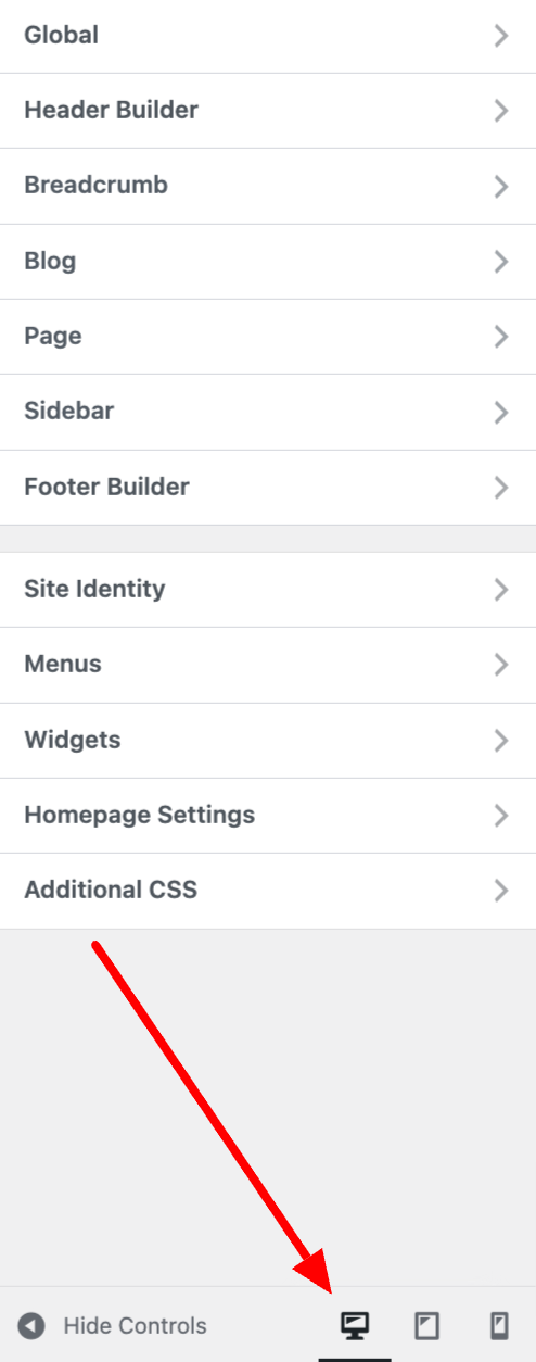
To help you see what your header looks like on a mobile or tablet, you can use the following tools:
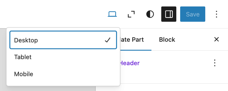
- The WP Customization Tool has 3 small icons to simulate the display of your header on a computer, smartphone, and tablet, which is a helpful to get a general idea. If you use a page builder, you will find that most offer the same operating mode. Check, for example, that the different elements are not too small, the links are not too close, and that the vertical size of the header is not too large.
- The WordPress Site Editor also offers three modes to preview your header on a computer, tablet, or mobile device.
- Globally, it is possible to check the responsive aspect of a website using the Google Mobile Optimization Test.
Remove the header from your WordPress site (in some cases)
Let’s end this tour of best practices with a piece of advice that may seem provocative to you, but it’s not at all.
But then, why would you want to delete your header on WordPress? Well, it’s a good idea if you want to design landing pages.
But beware, in the above case. Do not delete your header.php file ! The manipulation simply consists in creating a page template without a navigation bar (navbar). This is a feature that many themes offer, as well as the vast majority of page builders.
This kind of page is a little bit particular and aims to convert visitors by inciting them to download content (ebook, white paper), to subscribe to a newsletter, or to buy a product or service.
Generally, they do not contain a navigation bar or footer, to distract visitors as little as possible.
To learn more about the page builders and see a comparison of ten of them, visit our dedicated resource.
A header that’s heady
The header of your WordPress site is an element that should be designed with the utmost care. Very often, it is the first thing your visitors will come across as soon as they land on your site.
It must be clear, concise, and attractive to make them want to extend their visit and browse your pages.
Throughout these lines, you have been able to grasp the importance of your header on WordPress, and discover how to customize and optimize it.
For you, how important is your header? Give us your opinion by posting a comment.

Receive the next posts for free and access exclusive resources. More than 20,000 people have done it, why not you?

Continue reading
Articles posted in WordPress TutorialsHow to update the PHP version of your WordPress site
What comes to mind when you think of WordPress speed and security? Your favorite plugins, perhaps? You should also think about… PHP! If you’re looking for a site that loads fast, while offering a solid shield against hacker attacks, there’s a…
How to create an effective HubSpot conversion funnel on WordPress (complete guide)
In the drawers of a kitchen, there are often two very useful utensils lying around. The first is the colander. And to illustrate, some WordPress sites unfortunately resemble it. Why? Well, because visitors arrive on the site in question… then…
How to fix the ERR_CONNECTION_REFUSED error: A complete guide
Does your browser display the ERR_CONNECTION_REFUSED message when you try to access a website? This error means that the target server – or your own configuration – is actively rejecting the connection request, leaving you at a dead end. But…